Schloßgalerie Borbeck 2013
Fotos: Deimel und Wittmar
Einführung : Dr. Hella Nocke Schrepper
Translation: Monika Frost Pepper
„Colour possesses me. I don’t have to pursue it. It will possess me always, I know it. That is the meaning of a happy hour: Colour and I are one. I am a painter.“1
Impressed by the luminous colours of southern landscapes, Paul Klee noted these words in his diary while travelling in Tunis in 1914, together with August Macke and Louis Moilliet. They convey a new and intensive degree of perception of the co-lours in nature, which directly affected the use of colour as an artistic medium in the works of this artist.
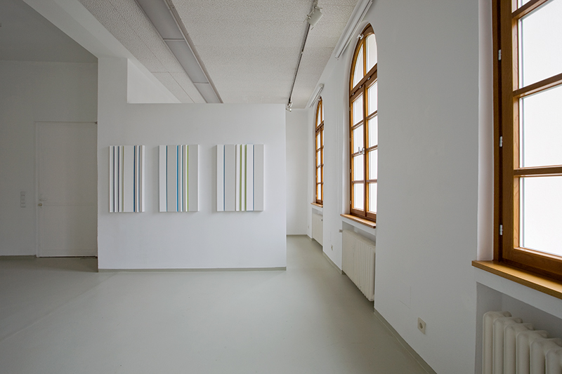
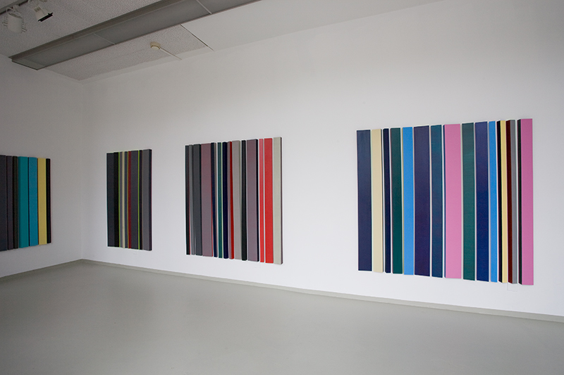
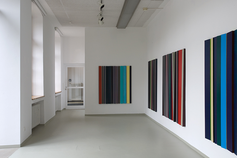
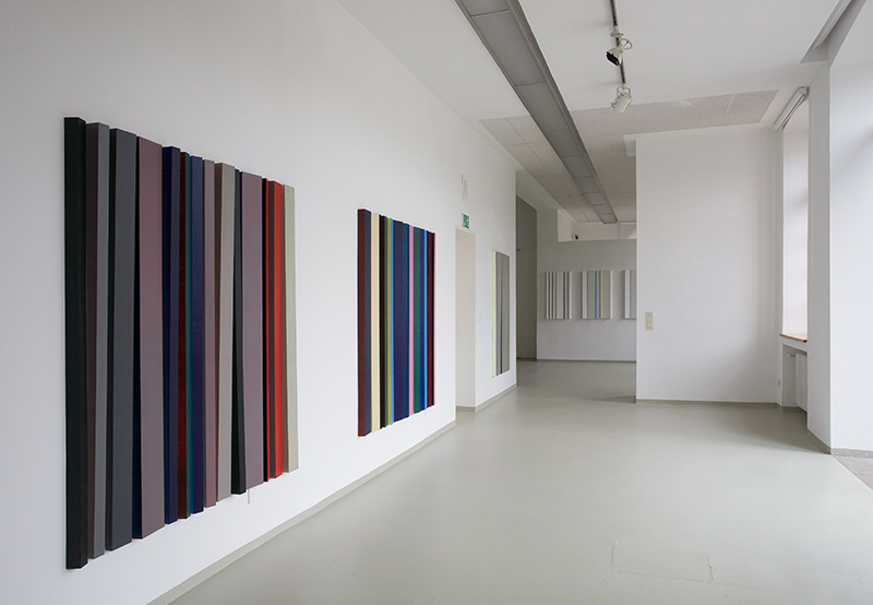
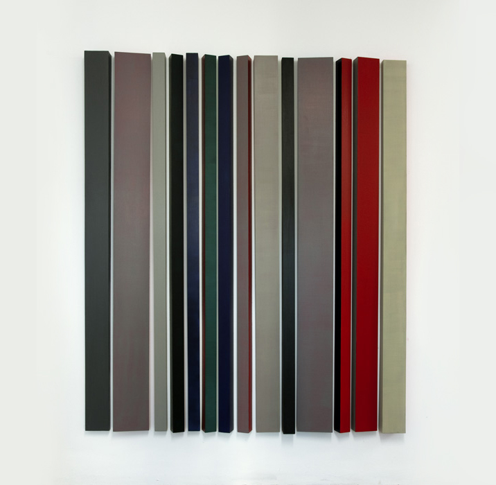
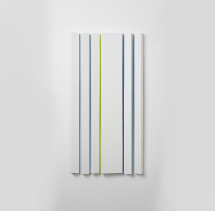
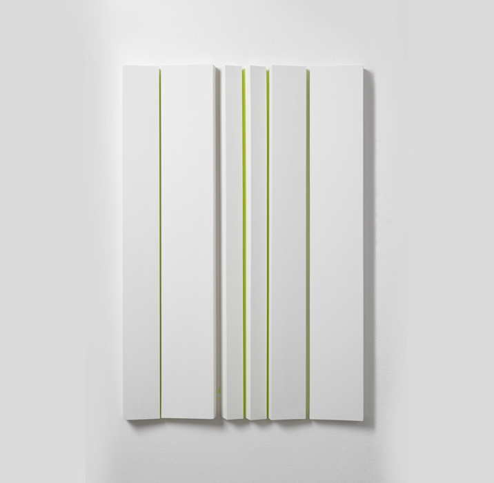
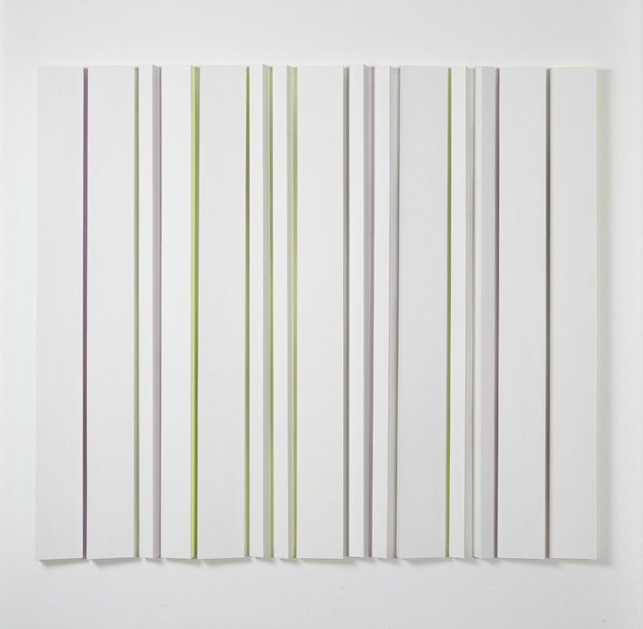
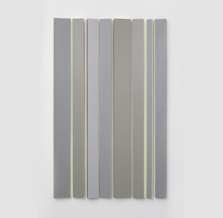
Similarly, colour has a special impact when viewing the works of Anne Berlit, who initially studied graphics and later specialised in sculpture, under the direction of David Rabinowitch, at the Academy of Art, Düsseldorf. For many years, colour as an artistic medium has been at the centre of her work. This is especially relevant for the series „Codes“, created between 2006 and 2012, and exhibited for the first time, almost in its entirety, at Galerie Schloß Borbeck. The title „Codes“ alludes to the colloquial use of the word for the transmission of messages and commands, which are put together and transmitted in accordance with fixed rules or patterns. Coded messages consist of letters, numerals, marks and other symbols, enabling short, concentrated communication through a previously agreed language system. This communication is based on the (transmitting) sender and the (reading) receiver and consists of concrete content or information. Shoppers and consumers have for many years been familiar with the standard bar codes on products. However, these cannot be read, and thus decoded, without the aid of special equipment, such as a scanner.2
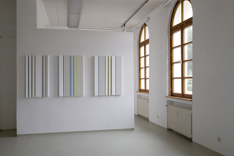
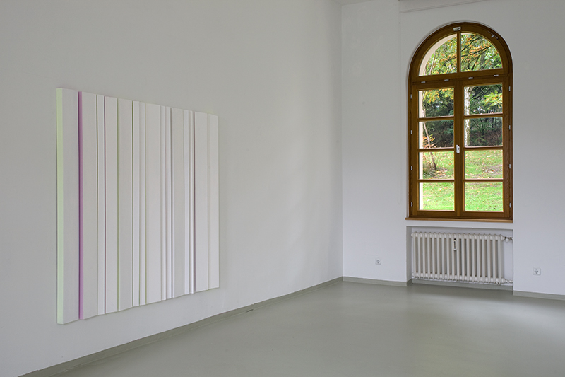
Anne Berlit’s wall pieces are reminiscent in form of these bar codes, due to the alignment of numerous thin, vertical elements made from fibreboard.3 These specially produced wooden elements of equal length vary in width, as well as displaying differently angled fronts, thereby breaking up the flat surface of a traditional panel painting. This results in a dynamic forward and backward movement, initiating interaction between line, plane and space. The expressive movements of the vertically elongated wooden elements are similar to slats, opening up an experience of space. Back in the 1950s, Lucio Fontana clearly aimed to overcome the flat surface in order to create volume by slashing the canvas of his paintings. In the „Codes“, Anne Berlit creates spatial images protruding from the wall into the room. These go beyond the conventional notion of a relief, turning into an object. The narrow gaps left between the wooden elements expose parts of the wall, giving rise to an interplay between light and shade.
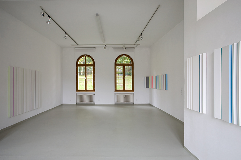
Vertical orientation has been a feature of Anne Berlit’s art works since the 1990s. Her graduation piece „Zwischenraum“ at the Düsseldorf Art Academy in 1999 consisted of six vertical, organically formed pieces of poplar wood, arranged in a circle to form an enclosed space. The distances between the wooden elements make this space seem permeable, light and transparent at the same time.4 The wooden elements, towering above at an approximate height of 2.2 metres, give the impression of a space which on the one hand is intended to protect people, but on the other is designed to be open to its surroundings. Her objects „Trennung / Fügung“ from the same year are similarly vertically aligned, using narrow, stringent, vertically arranged wooden elements. Furthermore, for her installation „stattwald“ (2002) in Essen city centre, where Anne Berlit broached social and urban topics, she positioned numerous untreated tree trunks on a wooden platform. The birch trunks with their sawn-off branches and crowns not only looked truncated and amputated, but also created a reference point for the viewer’s body – moving between the various tree trunks – by their vertical positioning. With her individual utilisation of colour, Berlit constantly crosses the border between sculpture and painting. The „Codes“ carry a multitude of varying colours: primary colour tones, mixed colours, non-colours and neon shades. Each „Code“ has its own language or temperature of colour: Sometimes strong colours dominate, contrasting with darker shades; sometimes achromatic shades have been applied to the front of the wooden elements, accentuated by brightly glowing colours on the narrow sides. Berlit mixes the colours completely intuitively during daylight and also sequences the colours within a „Code“ according to her personal colour perception.
Accordingly, the hanging of the works in the Borbeck gallery follows a „choreography“ specifically developed for that exhibition space: „With a bang“5 , the „Codes“ in strong, warm red tones open the show, creating a tension with yellow and light blue colours. Objects in bright mixed colours are then followed by works in grey and multi-coloured shades, ending with the latest „Codes“, which restrict themselves to whites with a few coloured accents. This provides a minimalist conclusion to the series – a kind of decrescendo, ending with an extremely sparse use of colours. The exhibition, therefore, also shows the development within the series, where quantity and intensity of colour change in favour of concentration.
But what is the effect of the colours within the „Codes“? If view-ers stand directly in front of a „Code“, the first impression is of various coloured stripes, positioned vertically next to each other. Through her consistent use of non-figurative elements, Anne Berlit follows in the footsteps of avantgarde concrete and constructivist postwar artists. Within concrete painting, stripe pictures, in particular, have often been created by painters such as Camille Graeser, Verena Loewensberg and others. However, their stripes are mostly horizontally orientated and often carry associations with landscapes. Here, the vertical wooden elements negate such associations and follow human dimensions in size. As a colour area, they set a visual exclamation mark.
The colours vary in density – in some areas the colour is half transparent, revealing several interpenetrating layers. Most colour surfaces are characterised by an even, forceful application of pigment, generating an enormous radiancy when viewed. As wooden elements and carriers of different colours, the „Code“ units protrude into the space from the wall and become colour bodies.6 Their three-dimensionalityty does not only result from the spatial construction of the wooden elements, but also from the newly created volumetric qualities of these elements as colour carriers. The colours of the wooden elements shine intensely onto the white parts of the wall in the gaps and, at the same time, onto their adjacent coloured elements. This creates colour lights, which mix expressively with the neighbouring colours. From the late 1940s onwards, Josef Albers examined such visual colour mixings, which are difficult to rationalise, in his series „Homage to the Square“. He takes the interaction between colours as concrete factuality and distinguishes between „factual fact“ (the actually used colours as constant data) and „actual fact“ (the effect of the colours at the moment of viewing). 7 For Albers, colours only become visible through interaction: they radiate „colour lights“ and directly influence the perception of neighbouring colours. At the same time, they depend on the colour and lighting of their environment and space. Albers saw colour as the most relative medium and a psychological phenomenon.
The colours in Anne Berlit’s „Codes“ do not just influence each other. Through their luminosity, the colour light, they embody colour reality and colour fiction. The colour light makes spaces appear in bright colours (or perhaps they are better described as „colour shadows“), making parts of the space visible which are otherwise not perceived. The colour light creates a colour space – dematerialising the architectureal space through its properties and the resulting diversity of its effects.
The impact of the colours on the viewer is enhanced by mo-ving in front of the objects: different viewpoints expose constantly changing colour areas within the wooden elements. When walking along the „Code“, it appears to undergo a colour metamorphosis: sometimes the front colours become visible, then those on the side parts. Constant movement in front of the object causes a complex flickering in the viewer’s eye. Colour stripes, colour shapes and colour space seem to dissolve expressively, similar to the effects of optical art.
The tendency to dematerialise colours and shapes also manifests itself in Anne Berlit’s delicate objects. „Schwebende Körper“ (2009) consists of approximately 90 wooden sticks, arranged on top of each other like a mobile, swinging slightly in the space through shifting air currents.8 The installation, consisting of fine neon-coloured pieces of string, hanging vertically from the ceiling in an almost square corner of the Borbeck gallery, display colour themes within the space.
The top section of the strings is white, like the ceiling, where-
as the bottom section is grey, like the floor. Thus the bright neon-coloured strands seem to float in space like vertical lines. When moving around the group of coloured threads, the viewer experiences fascinating and incredibly delicate displays of colour and light, caused by the countless intersections of the coloured lines. Another possiblity of experiencing immaterial colour effects is playfully presented, paving the way for a totally different view and perception of spaces – always emanating from the interaction9 with the viewer.
Opening speech, 12.10.2013, for Anne Berlit: „Codes“, exhibition at Städtische Galerie Schloß Borbeck, Essen.
1 Paul Klee, Tagebuch. Quoted in: Giedeon-Welker, Carola, Klee. Rowohlt. Reinbek. 22nd edition, 2004, p. 43.
2 Depending on the horizontal expansion of the „code“ on the wall space, an object consists of 12 to 20 coloured wooden elements.
3 see Jan Giebel, Anne Berlit. In: „chambres d´étude“. Anne Berlit. Exhibition Catalogue, Kunsthistorisches Institut der Universität Osnabrück 2012, p. 6.
4 Anne Berlit in conversation with the author, 10.10.2013, Essen.
5 The works and colloquia by Gerhard Graubner provided Anne Berlit with a significant insight into the concept of the spatial qualities of colour. – see Giebel in: Exhibition Catalogue 2012, p. 6.
6 Josef Albers, Interaction of Color. Grundlegung einer Didaktik des Sehens. Köln 1970.
7 Illustrations, Anne Berlit. Potentiale. Publisher: BeSt-Kunstraum. Essen 2010, p. 61, and Exhibition Catalogue, Osnabrück 2012, p. 14, 16/17.
8 For the meaning of interaction in the works of Anne Berlit, see Uelsberg, Gabriele, Gedankenmanifestationen. In: Anne Berlit. Potentiale. Publisher: BeSt-Kunstraum. Essen 2010, p. 5.[/vc_column_text][/vc_column][/vc_row]